|
|
|
|
|
|
|
|
124 W. Main, P.O. Box 550, Crosbyton, TX 79322 (806) 675-7777 (806) 675-2421 (Fax)
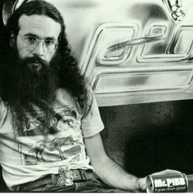
MR PIBB and the Little Ladies
Could there be a connection between lettering on a modern soft drink can, Nazi Germany and our founding fathers? Maybe. Lets see.
Before Joe Taylor (thats me, above in 1972) started digging up fossils all over creation, I designed typefaces (lettering) and did art work for several Patriot organizations. So? Whats this about Mr. Pibb, and the Nazis?
About 1979, while working on some projects about America's true, Christian heritage, I had the privilege of meeting with the "little ladies", as they were affectionately known.

Verna Hall and Rosalie Slater published two thick volumes about Christian Self-Government, full of America's most profound documents. Despite their "grandmotherly" appearance they were historians in the extreme. They knew not only political history, but art history as well.
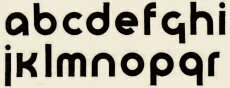
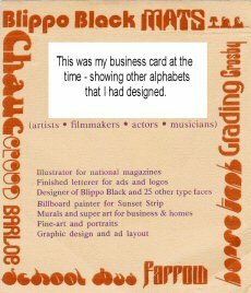
(A similar font designed by my art partner, Joel Peck - who is
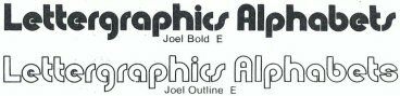
now my assistant here in the Mt. Blanco Fossil Museum)In conversations with them it came out that I was the designer of a typeface called Blippo Black (1969). They perked right up when I told them my idea for the face had come from an unpublished design from the thirties originating in the German Bauhaus school. Oh, yes! They knew all about the decadence of pre-nazi, German culture, and how it led to Hitler's Third Reich! My design was not good, they would have me know. Witness the lack of serifs on the ascenders and descenders. This lack of "toes" on the letters was unacceptable, theologically. See, to a real, Christian presuppositionalist, nothing is secular. Even lettering design must be theologically correct. Better, they advised me, were the Roman classical letters such as Times Roman, commonly used for the copy in most newspapers. None of this pre-Nazi, sans-serif stuff!
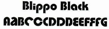
Unfinished Bahaus faceBlippo Black was named by my German-Jewish boss, Mr. Robert Trogmann, in 1969. It premiered in Berlin that same year. My design was a black version of Burko Bold, which came from the unpublished Bauhaus face of the thirties.
My eyes were killing me after designing and inking 141 characters in seven days!
Bob declared it to be "perfect". It was one of the top selling alphabet fonts for several years. Among millions of products and ads using it were MR PIBB and The Beatles.
Today, in 2003, you can go into almost any store and find Blippo Black on some product.
|
|
|
|
|
|
|
|